CTA Funnel performance
Your RightMessage dashboard provides a wealth of information around your segmentation and lead generation / offer engagement activity.
In this guide, we’ll walk you through each component of your dashboard.
Selecting a time window
By default, RightMessage reports on the last week (7 days) of activity.
From the top right of your dashboard, you can select a different time range.

Opt-in rates
The opt-in rate percentage that you see highlighted is the overall opt-in rate for your selected time period.
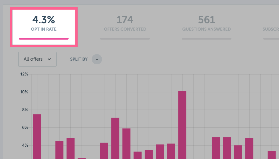
Below this percentage, you’ll see a chart showing the daily opt-in rate for each day in your selected time range.
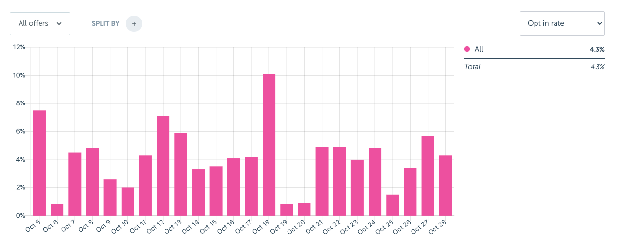
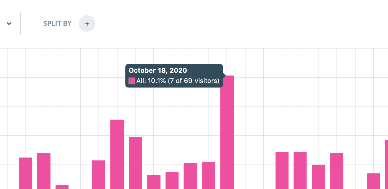
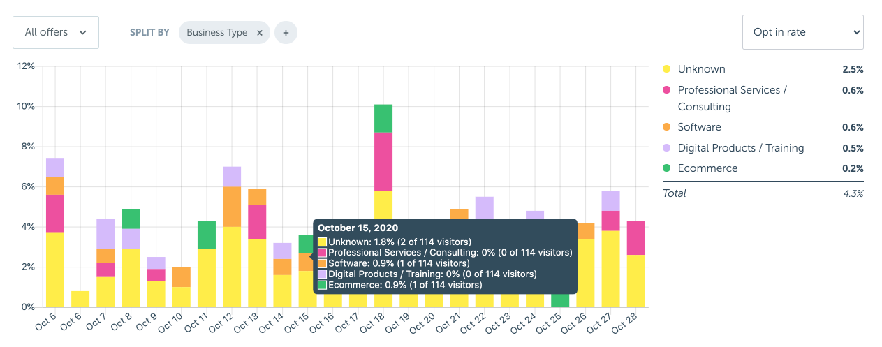
Hover on any of the columns to see specifics: how many unique people visited that day, how many converted, and what the percent conversion was.
Toggle All Offers → Separate offers to see your daily conversions, separated by CTA Funnel offer:
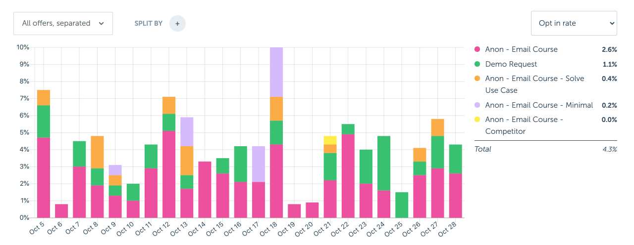
Additionally, you can split your daily opt-ins by any segment data that we had at the point of conversion. This means that if you’re asking about a visitor’s business type prior to showing a personalized opt-in, you’re able to report on specifically how each type converted relative to each other:
Offer conversions
The “Offers Converted” number highlighted is the number of offers that converted during your selected time period. Above the chart, you can see the overall offer conversion percentage.
An offer conversion is either:
- An offer form that was submitted
- A “click through URL” offer that had someone click on the call-to-action button
This chart has two graphs. The first (grey) shows the overall number of people who saw an offer each day. The second (pink) charts the number of people who converted.
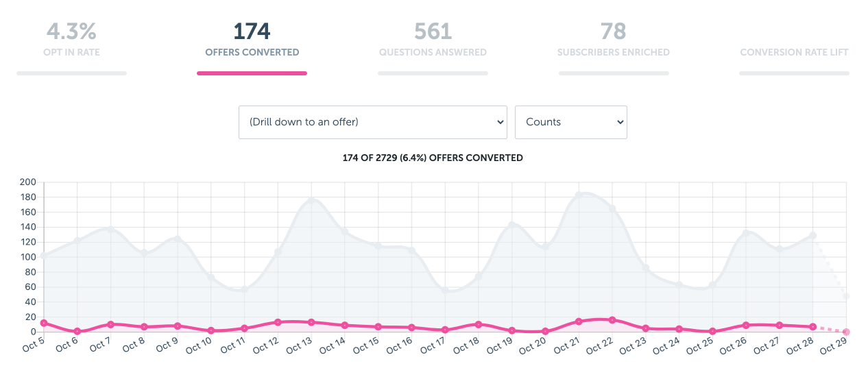
Highlighting any day displays specifics about the number of people who were pitched, and the number who converted.
You can also drill down to a specific offer to see individual offer performance with the (Drill down to an offer) dropdown, or change the Y-axis of the chart from total numbers to conversion percentages.
Questions answered
The “Questions Answered” number highlights the number of questions that were answered during your selected time period. Above the chart, you can see the overall question answer rate.
This chart has two graphs. The first (grey) shows the overall number of people who were presented with a question (powered by a CTA Funnel) each day. The second (pink) charts the number of people who answered.
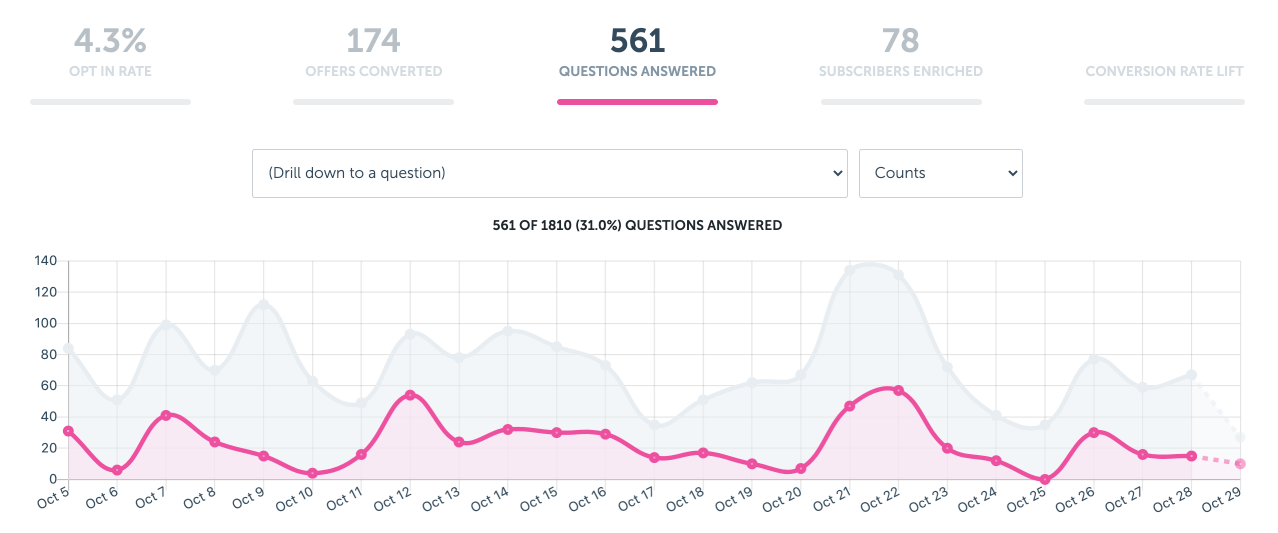
Highlighting any day displays specifics about the number of people who were asked a question, and the number who answered.
You can also drill down to a specific question to see individual answer rates with the (Drill down to a question) dropdown, or change the Y-axis of the chart from total asked to conversion percentages.
Subscribers enriched
This final chart shows how many subscribers were enriched via our ESP/CRM synchronization.
When RightMessage successfully sets data on a contact record, either because a visitor answered a question or because they were auto-segmented into a Segment Group with ESP/CRM synchronization, then this update will be reflected in your daily “Subscribers Enriched” count.

Split testing CTA Funnels
You can also test various CTA Funnel offers with RightMessage. Unlike with more traditional A/B testing platforms, our unique ability to hyper-target visitors gives you the ability to run laser target conversion optimization tests.
- About Us
- Contact Sales
- Contact Customer Support
- © RightMessage Inc. 2024
- Privacy Policy
- Terms of Service
